
THE LIVING PALETTE
How to Use Plants and Colour to Design Your Space ?
Most people pick plants the way they pick a sofa: they see it, they like it, they buy it, they put it somewhere, then wonder vaguely why the room doesn't feel right. The pot is cute. The plant is alive. And yet the whole thing sits there looking a little apologetic.
The problem is almost never the plant. It's the relationship between the plant, its container, and everything else in the room. Colour, in other words. Not in a precious, colour-wheel-on-the-wall way. In the very practical sense that every object in a room is broadcasting a hue, and your plants are no different.
This isn't about following rules. It's about understanding enough to break them well.
The basics, quickly
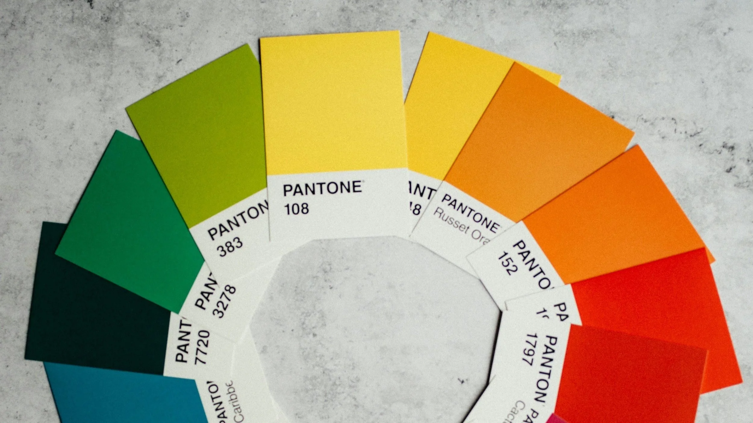
Colour theory has been formally articulated since at least the eighteenth century, but the version most useful for interior spaces comes from Johannes Itten's The Art of Color (1961), which introduced the idea of colour relationships as emotional and spatial tools rather than simply aesthetic ones. Three relationships matter most when you're composing a room.
Complementary colours sit opposite each other on the wheel. High contrast, high tension. A deep green plant against terracotta walls. Alive, slightly uncomfortable in the best way.
Analogous colours sit adjacent to each other. Low contrast, high harmony. Several greens together, or green with warm yellow. Easy to live with, but consider the risk of monotony if you're not careful.
Triadic relationships involve three colours equally spaced around the wheel. More complex to pull off. When it works, for example a dark pot, a pale wall, a warm-toned plant, the room earns its own character.
These aren't prescriptions, they are rather a sort of vocabulary. Once you understand what a complementary relationship does to a space, that is the friction it creates, the way it wakes a room up, you can decide whether you want that, and how much of it.
Green is not a colour. It's an argument.
People say "I want more green in the room" as if green were a single thing. The green of a monstera deliciosa is a deep, blue-shifted, almost waxy dark green. The green of a golden pothos leans warm and yellow. A snake plant tips toward grey-green. Certain succulents go blue. Some go near-black.
Blue-green: monstera, bird of paradise.
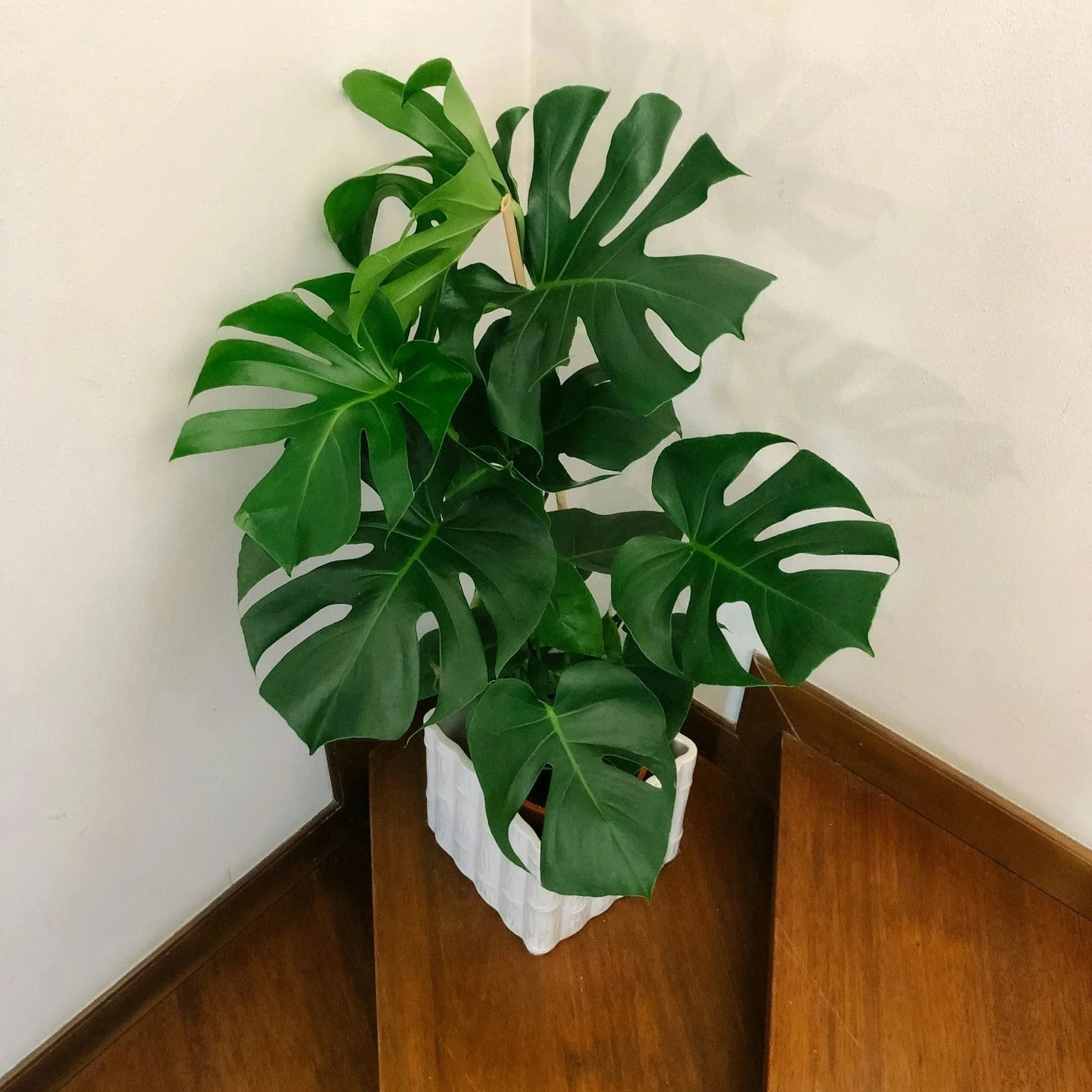
Cool and receding. Reads as formal. Works against warm terracotta, raw concrete, aged brass. Can feel uncomfortable next to cool grey walls — too much blue in the same register.
Yellow-green: pothos, philodendron Brasil.
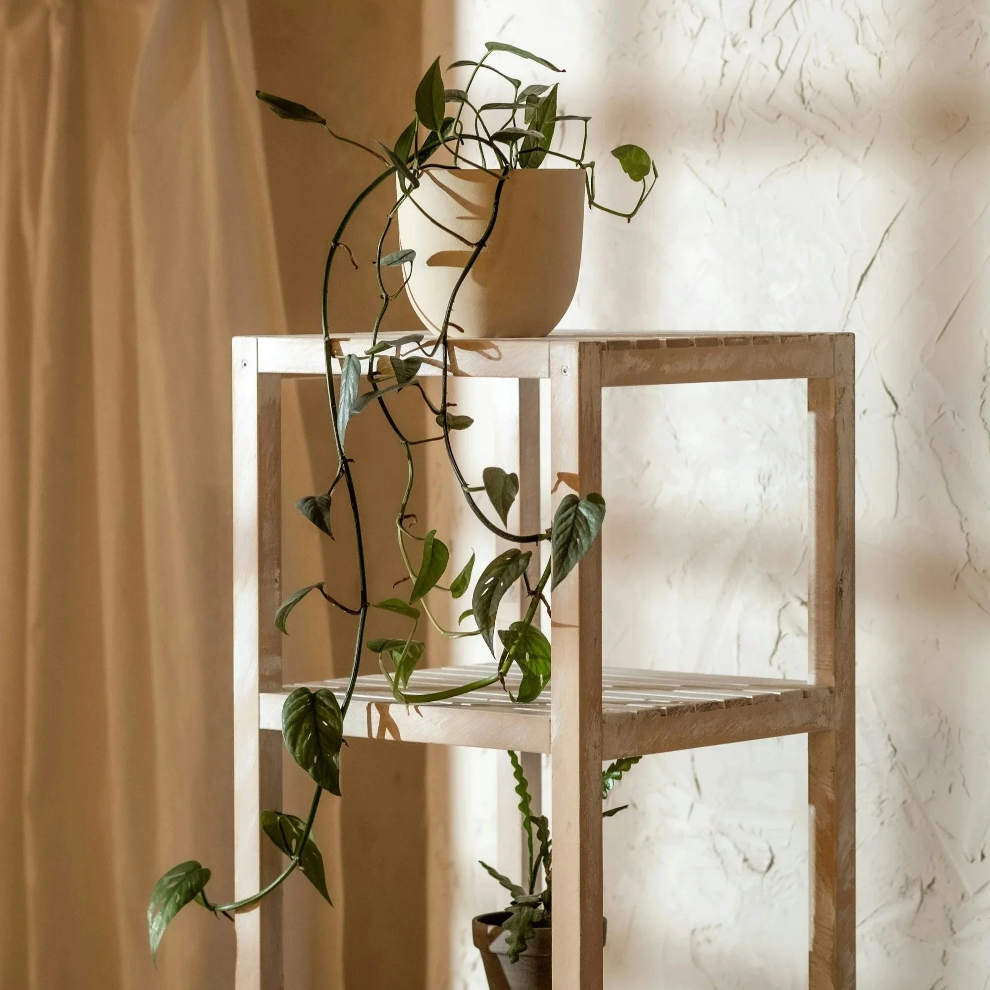
Warm and advancing. Energetic. Pairs well with deep navy, charcoal, dark wood. Can overwhelm rooms that are already warm or pale yellow.
Grey-green: snake plant, ZZ, agave.
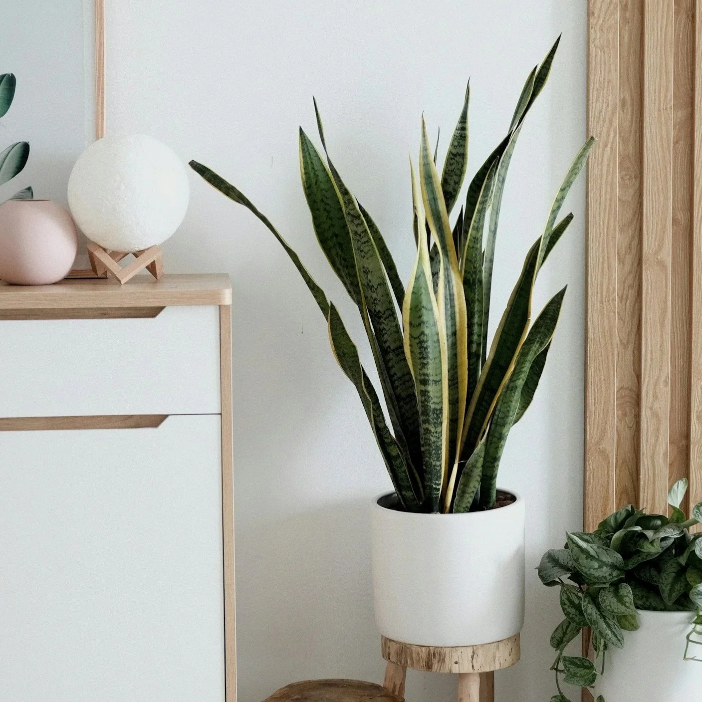
Neutral-leaning. The most architectural of the greens. Works almost anywhere, which also means it can disappear if you're not careful about contrast.
Blue-grey-green: Aeonium, certain ficus.
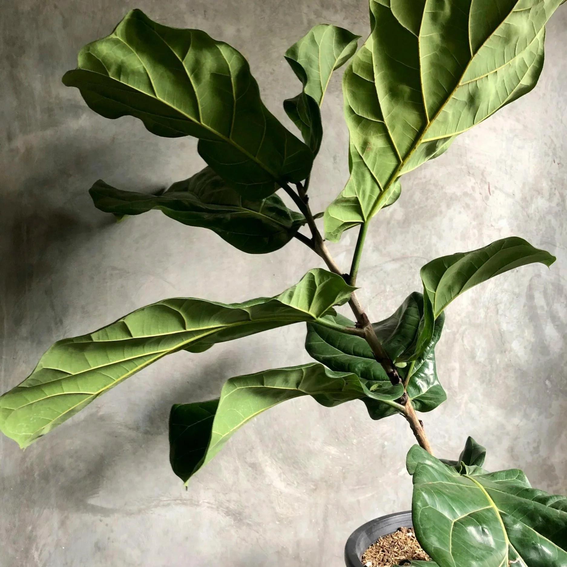
Quiet and sophisticated. The plant equivalent of a well-chosen stone. Strong enough to anchor a neutral room without competing with anything in it.
Near-black: dark succulents, certain cacti.
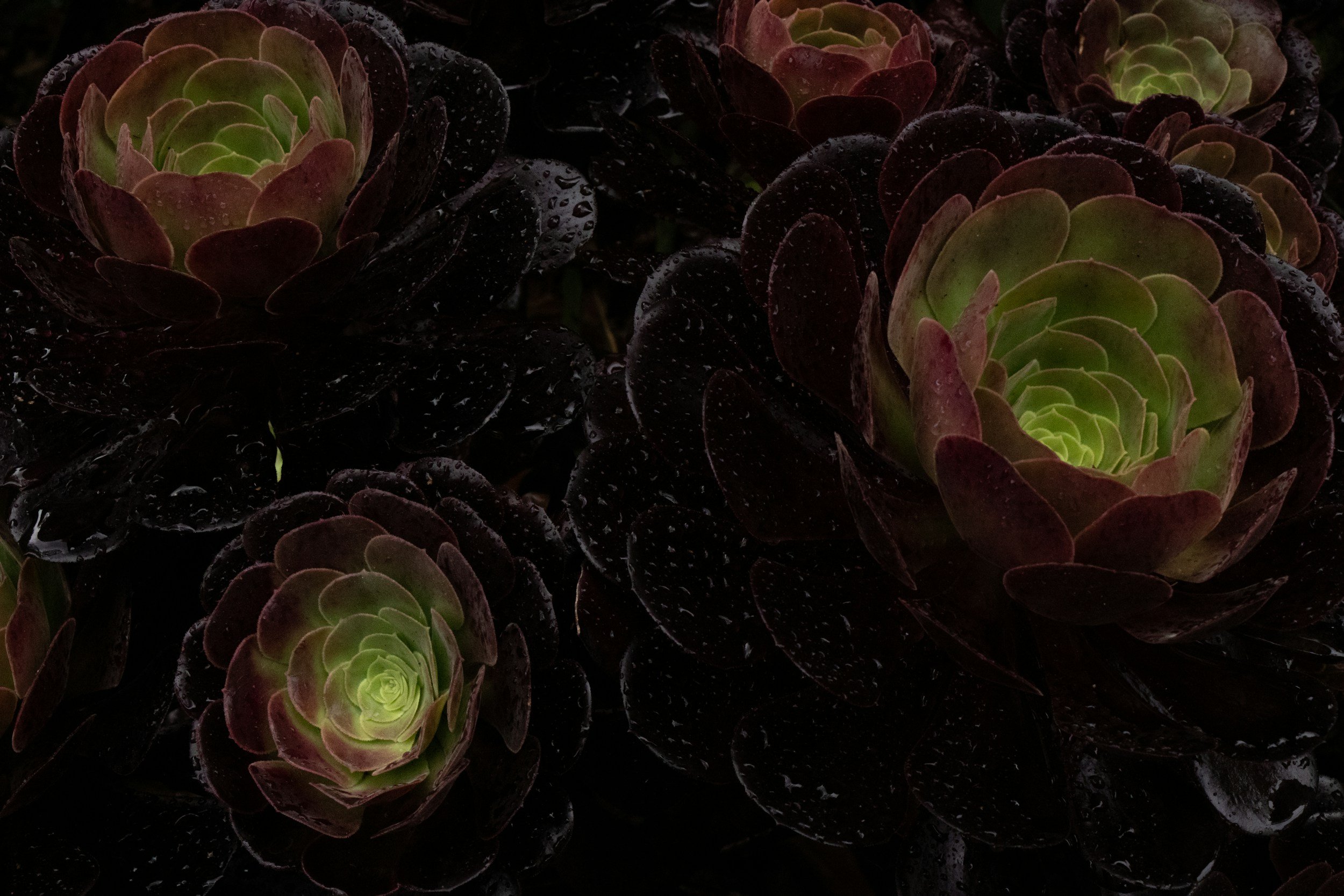
Technically green, functionally a dark neutral. Behaves like charcoal in a composition. Very good against pale plaster or linen. Easy to underuse.
The point is to develop the habit of looking at plant colour with the same precision you'd apply to paint. Ask yourself not only “Is this green?" but also "Which green? Leaning where? Against what?"
The planter as colour anchor
A planter does two things simultaneously: it contains a plant, and it sits in a room. Most people think of it primarily as the first. Designers think of it as the second.
The decision between a neutral planter and a statement planter is a real one with real consequences. A neutral planter, i.e. raw concrete, unglazed terracotta, off-white, defers to the plant. The colour composition of the display is led entirely by the foliage. A statement planter, i.e. a deep matte black, an ochre glaze, a dusty sage, enters the room as its own element, creating a colour relationship with the plant that lives in it.
What matters more than the choice itself is the awareness that you're making one. A concrete sphere planter is not colour-neutral. Concrete has a warm grey tone that interacts with the greens above it. An unglazed terracotta pot carries a quiet, persistent orange-red. These are colour decisions, even when they look like non-decisions.
And what about texture and colour perception? Texture changes how we perceive colour. A matte surface absorbs light and reads slightly darker, more saturated, more present. A glossy surface reflects light and reads lighter, cooler, more receding. This is why the same colour in a matte glaze versus a gloss feels like two different colours and why a high-gloss planter can visually distance itself from a plant it's meant to anchor.
For most interior plant compositions, matte or semi-matte surfaces read as more integrated. They don't compete. Research on colour and interior wellbeing consistently shows that matte surfaces are perceived as calmer, more settled, which matters when you're composing a space you have to actually live in.
Seasonal colour shifts: designing with, not against
Plants change. This is obvious, and yet most people design around plants as if they were static objects. As if the bright yellow-green of a pothos in summer is the same as its slightly more muted, blue-shifted winter tone, or as if their agave's colouring won't deepen with more light.
The practical move is to design the room around the plant's primary season, whatever state it spends most of its year in, and accept the seasonal variation as the room changing slightly, rather than fighting it. A room composed in a complementary relationship between deep green and warm clay will still read as intentional in winter when the green shifts toward blue-grey.
Where people run into trouble is when they've built an analogous composition, that could be all warm yellows and yellow-greens, and one plant goes dormant and turns a cooler, flatter green. Suddenly the harmony is off. The solution isn't to panic and move everything. It's to understand that analogous schemes require slightly more attention to seasonal drift than complementary ones, and to build in a little contrast elsewhere, such as a stone planter or a dark textile, that holds the room together through the shift.
Room by room: light changes everything
The single most underestimated factor in plant colour is the colour temperature of the light the room receives. A plant that looks one way in a north-facing room with cool, diffused light looks genuinely different in a south-facing room with direct afternoon sun. The plant hasn't changed. The colour rendering has.
North-facing rooms. Cool, even light. Blue-greens read true here and a monstera or bird of paradise looks exactly as intended. Warm yellow-greens can look slightly washed out or sallow. Compensate with warm-toned planters: raw terracotta, warm stone, ochre glazes. They push back against the blue cast of the light.
South-facing rooms. Warm, often strong light. Yellow-greens intensify and can become almost chartreuse by late afternoon, which is either wonderful or overwhelming depending on what else is in the room. Blue-greens pick up warmth they don't have in cooler light. Lighter planters, such as pale concrete or off-white ceramic, help balance the warmth without cancelling it.
Small spaces. Colour shapes how space is perceived. Cool greens (blue-green, grey-green) recede and make a small room read slightly larger. Warm greens advance and can make a small room feel cosier, good or bad depending on what you want. One larger plant tends to be less visually disruptive than several small ones in a restricted space, because it reads as a single colour event rather than several competing ones.
Large spaces. You have room to work with contrast. A complementary composition, for example warm terracotta walls, blue-green plants, dark concrete planters, can anchor a large room in a way that a purely analogous scheme can't. Use the space's scale to justify bolder colour decisions. A single sphere planter that would look too dominant in a small flat becomes exactly right in a large room.
The intention is the point
None of this requires a colour wheel on the wall or hours spent with paint chips. It requires a shift in how you look at plants. Recognising that every foliage colour, every glaze, every matte or glossy surface is doing something in your space, whether you planned it or not.
The difference between a room that feels designed and one that just feels lived-in is largely this: in the designed room, somebody noticed. They noticed that the warm grey of a concrete sphere planter against a deep blue-green plant creates a specific kind of quiet tension. They noticed that the yellow-green of a philodendron would clash with the pale yellow paint on the wall. They either avoided it deliberately or leaned into it deliberately.
Plants are alive. That means that they change with light and season. They're not art objects with fixed properties, they're dynamic participants in the colour of the room. Once you start seeing them that way, choosing one becomes a significantly more interesting decision. And getting it right becomes less about luck and more about understanding what you're actually choosing between.
Which is, when you think about it, what design always was.